Message in a bottle
Designer Itamar Gur thinks that before you open your next bottle of wine you should take a moment to look at the label. Someone just may be trying to tell you something important.
For as long as I can remember, I’ve been a compulsive collector of things that I love: marbles, stamps, playing cards, business cards, and over the last few years wine labels. In fact, I still have the bottle my wife and I were drinking when I proposed to her stored somewhere in my closet. The meal itself was actually unmemorable to say the least, but the wine was outstanding and is permanently etched in my memory. Over the years my wine collection has become quite formidable, and the labels have piled up, until one day I had an epiphany relating mostly to design and a wine bottle’s appearance.
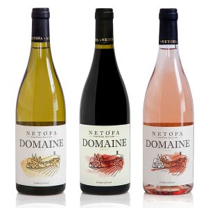
Most consumers, in Israel as well as abroad, usually make their purchasing decision based on the appearance of the wine label, which acts as a sort of ID card for the wine itself. The label incorporates a multitude of graphic details within it, alongside text which provides info on the product inside. This is basically the main channel of information between the consumer and the manufacturer.
The first impression is made by the bottle’s ‘outfit’. The outfit is comprised of the front and the back labels and the capsule, which is where the winery’s name, location (a direct indicator of the grape’s region, species and country of origin), vintage, alcohol level and more are usually displayed in accordance with the regulations of the country of origin.
To effectively leverage the label as a medium of communication, the winery needs to make sure that the label designer has a clear understanding of the desired message. It’s the designer’s job to find the right way to relay this message to the consumer. This is no easy task; the designer needs to find the right way to differentiate the wine while ensuring that the label is aligned with the specific wine brand and the winery itself. The designer will only be able to accomplish this after discussing the message with the winery/brand owner and understanding the message and vision behind the product.
Who am I? What am I?
The wine industry is currently undergoing a very interesting, even versatile revival. Today wines differentiate themselves not just by their taste, but also by their labels, brand and appearance. The label communicates the essence of the wine to the consumer, attempting to sway the consumer’s purchasing decision in its favor.
As you might imagine, it’s all about finding the perfect way to present the wine’s technical information in an appealing manner. There’s a gentle balance between the label’s appearance, the info and specs displayed there and the wine itself: its flavor, personality, winery, geographic region etc. I’ve decided to use a label that’s near and dear to my heart to illustrate my point, without regard to my deep, personal love for this specific wine.
Margalit Winery’s label resonates with a rural simplicity that embraces family values on the one hand, while at the same time expresses the luxury boutique essence that the wine embodies. The label’s size is in perfect proportion to the bottle’s ‘muscular’ shape, while the label’s diagonal shape is well-suited to the bottle itself. The text and the label’s appearance are in harmony with the bottle’s outfit without dominating the bottle.
Minimalism at its best
There exists a strict hierarchy between the winery’s logo and the other information on the label. The wine’s brand name is printed in a large, thick font as opposed to the text detailing the wine species and its amounts which appear in a small, thin handwritten-like font. The only graphic elements employed are the ‘character’ (the logo) and the winery’s name as a signature. The label’s design uses just two colors, bordeaux and black, which create a powerful contrast that is extended to the brand’s visual language.
As opposed to other wineries that base their visual language on well-known techniques (gold/silver as a brand color, deep etching and bold) to capture the consumer’s attention, for the last 20 years Margalit Winery has been using a classic minimalist design centered on precise color usage.
Even the type of paper used in Margalit’s label was carefully considered during the design process. In this case, the label paper offers a gentle yet rugged texture that gives the consumer a feeling of subdued luxury.
So next time you’re in the market for a bottle of wine, take a moment to open your eyes, look at the label and see what the wine is all about.

